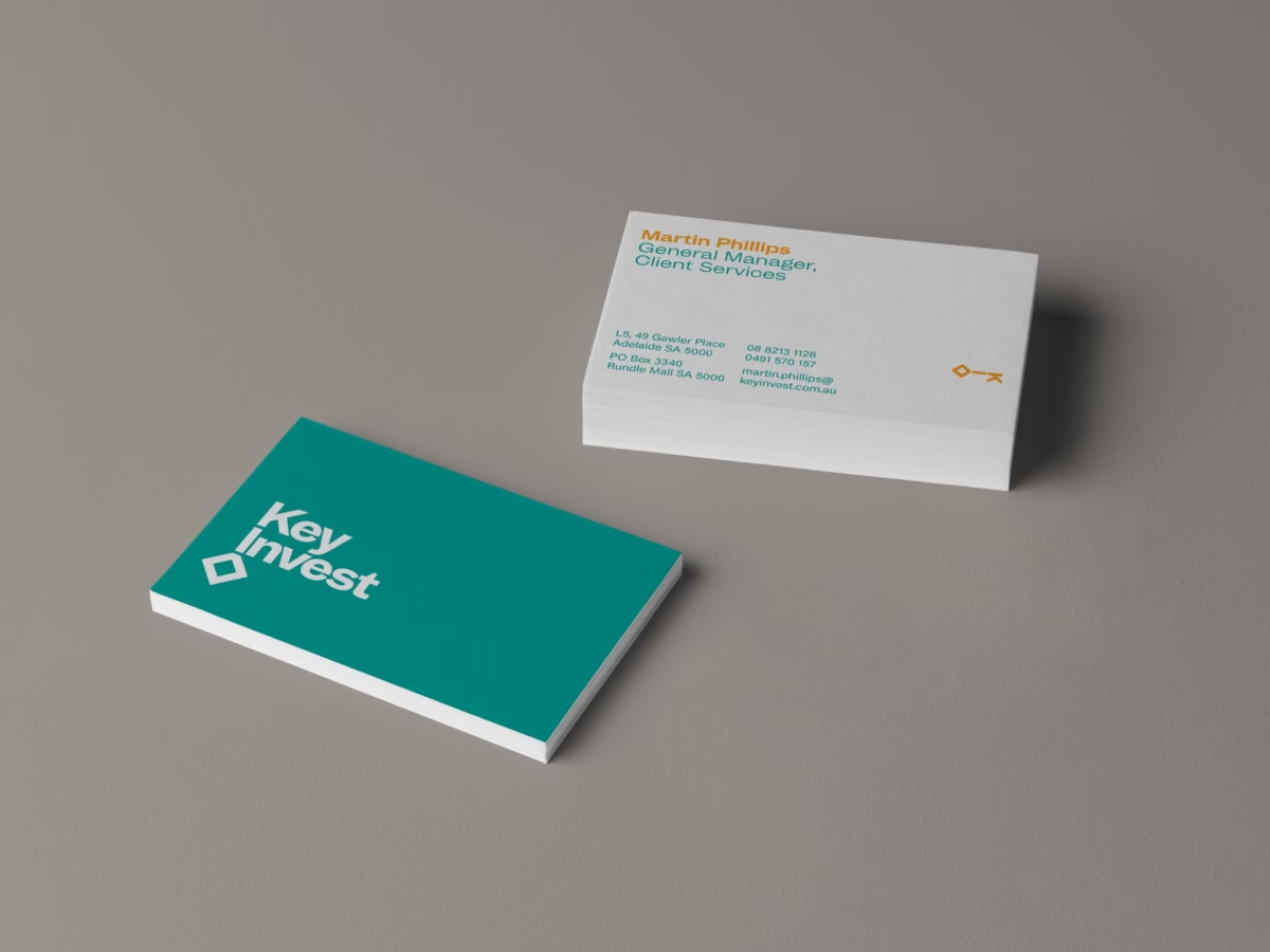
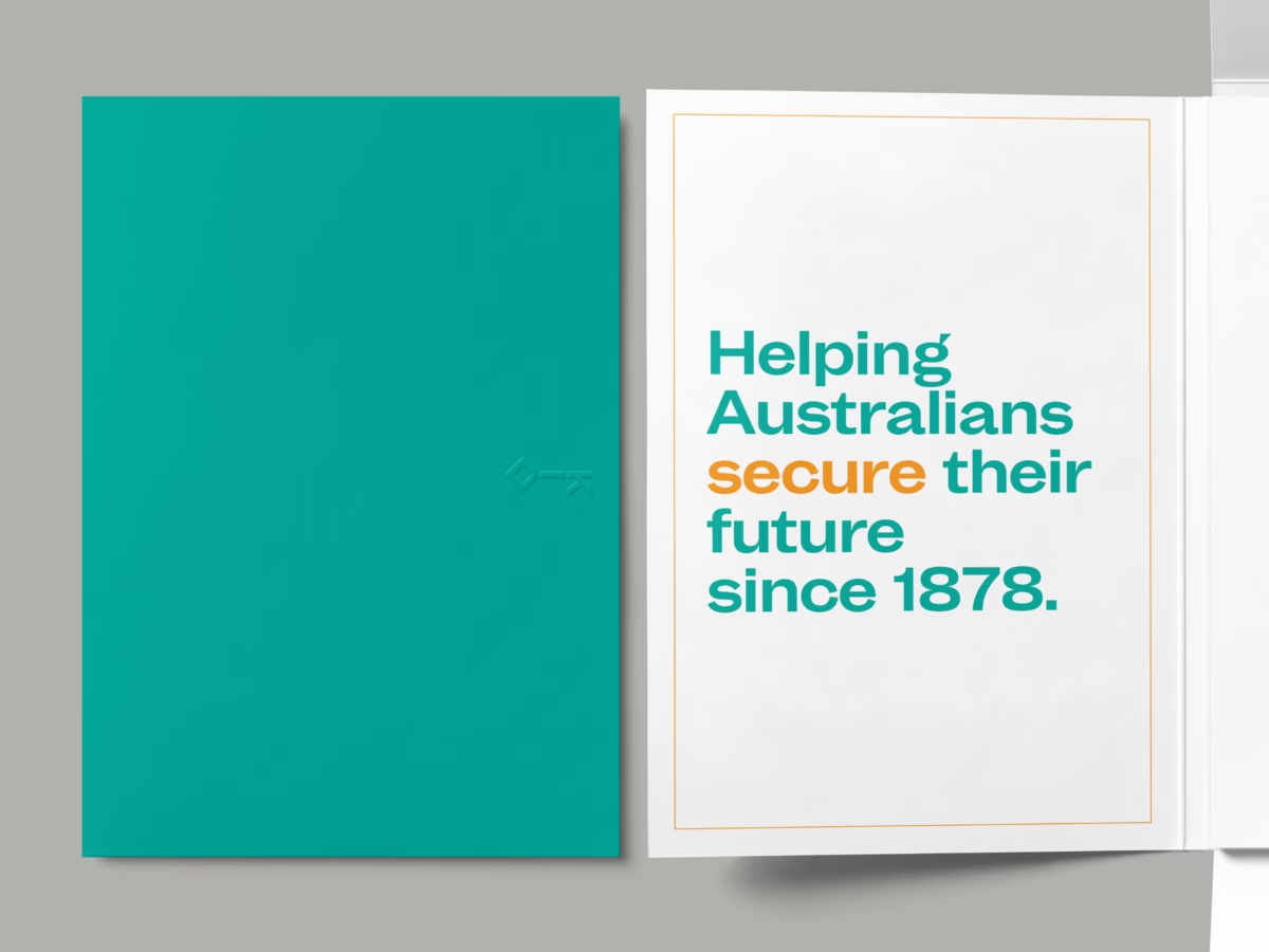
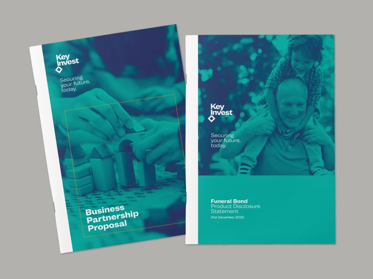
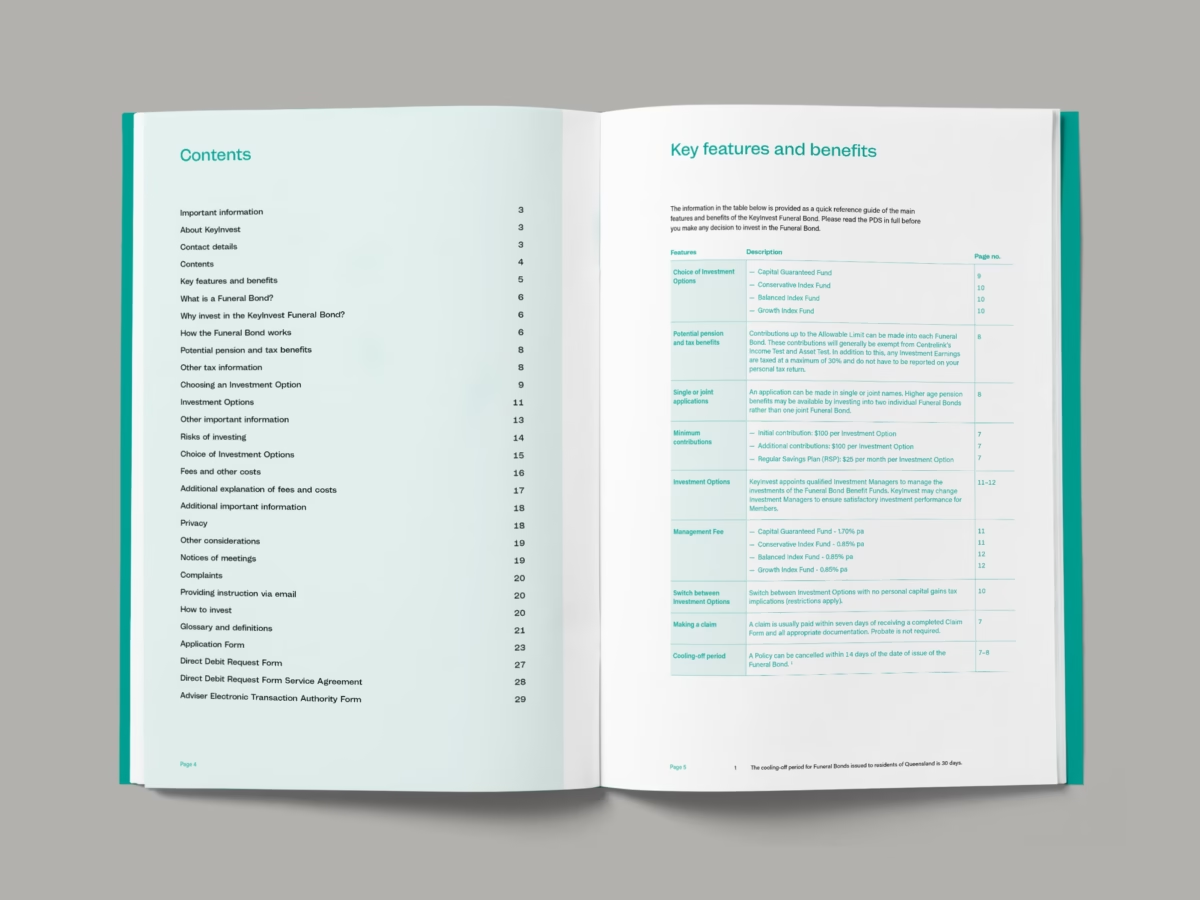
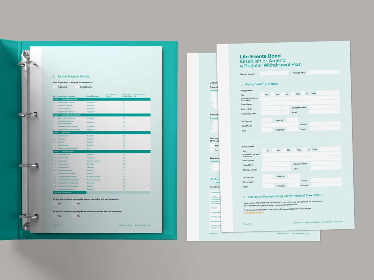
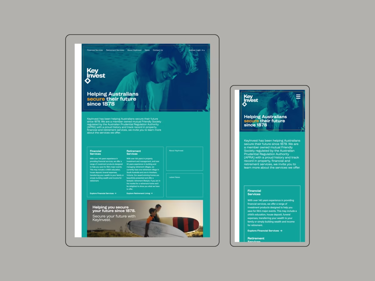
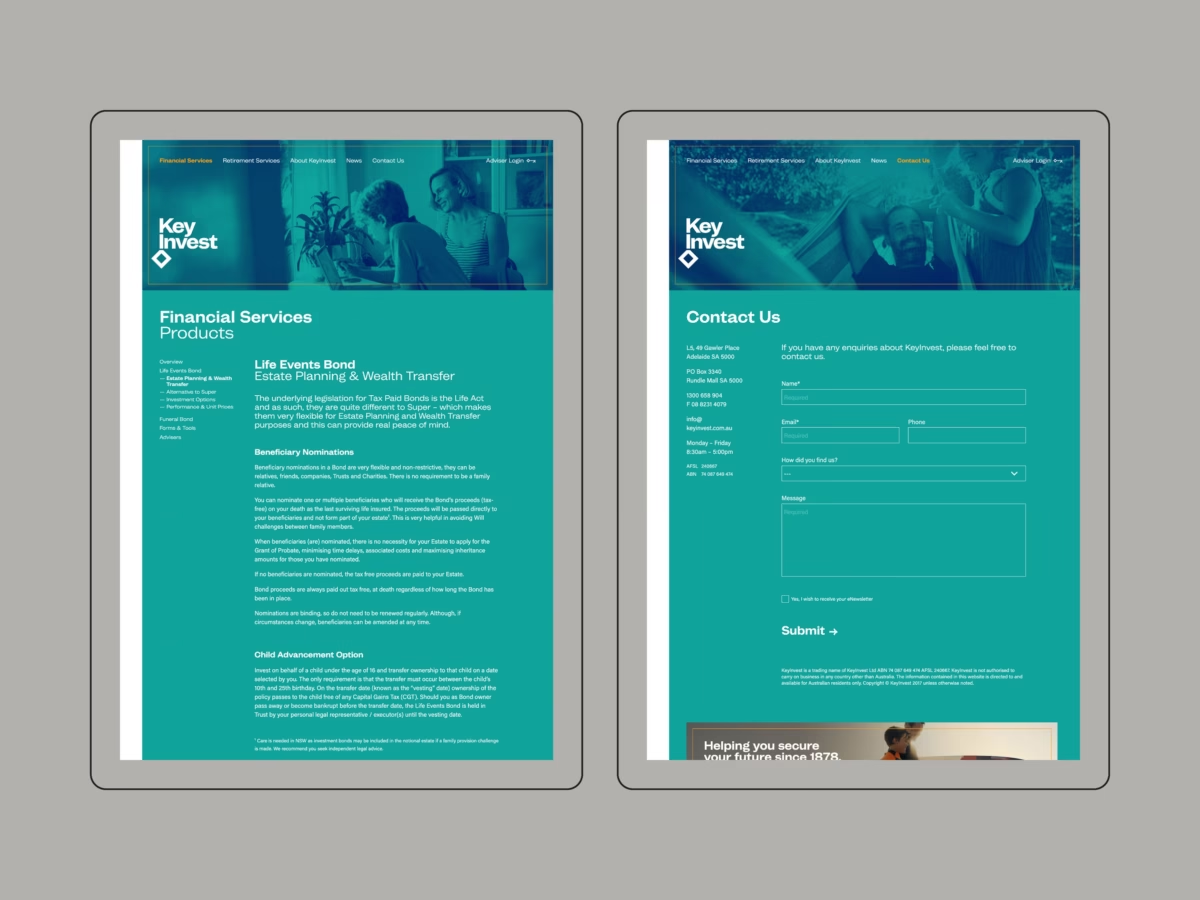
We worked with the KeyInvest executive team to develop and implement a total overhaul for their brand identity.
The organisation needed to move away from its unusual historical link to The Independent Order of Odd Fellows and rebrand under a more marketable name and image. The previous visual identity was based on esoteric symbolism which created confusion in the market, particularly when expanding into new regions that had no contextual reference to the 140 year old institution.
Our solution was to create a focus on the name KeyInvest, that had been in play for a few years, and develop an identity that leveraged the literal meaning of the name and the metaphorical aspect as it relates to financial investment products; the key to unlocking your future. A bold colour scheme was selected to stand out in the crowded retail finance market.
The key motif—formed from the stacked word mark—is a subtle reference to their name and the promise of a secure future for their clients.
