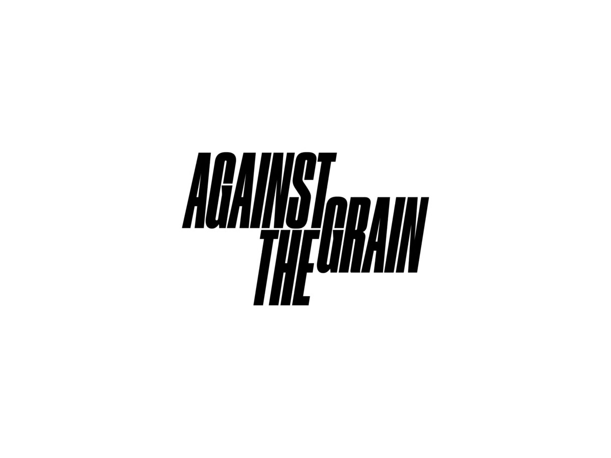
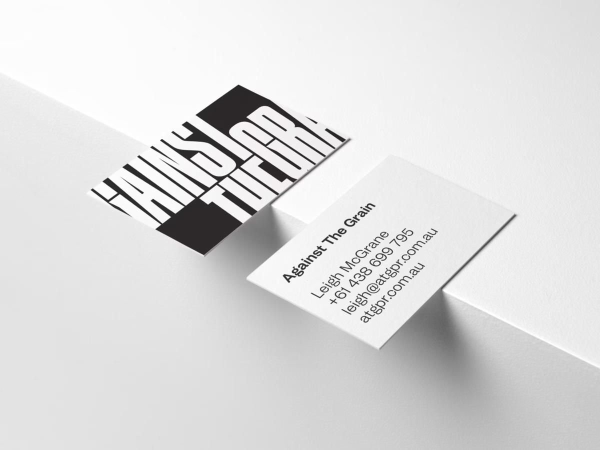
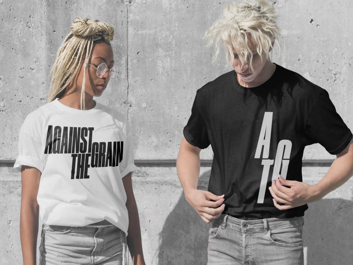
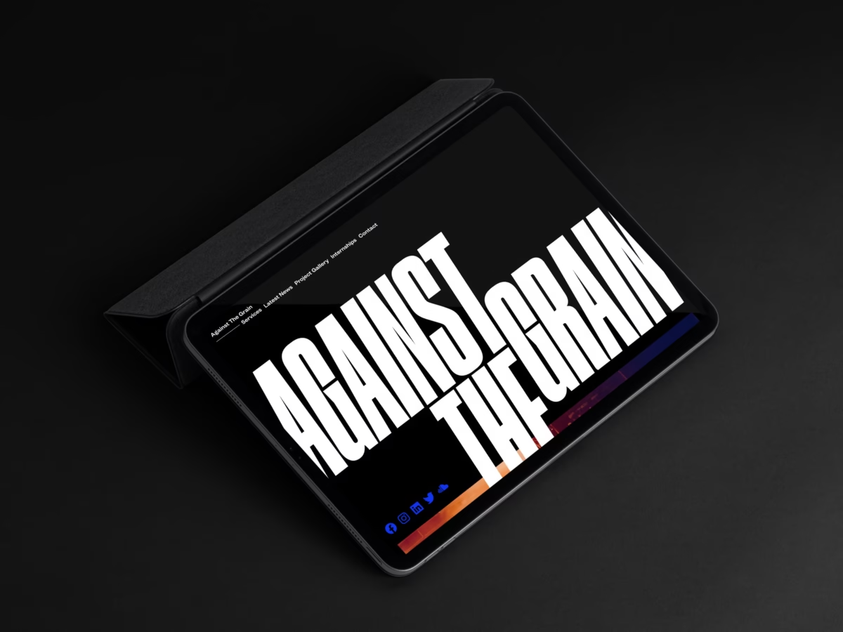
Leigh McGrane wanted to shift tack with his business to attract a broader range of clientele beyond the, almost exclusively, arts based clientele he was working with. While not wanting to alienate his existing clients, he needed to rebrand to make a statement. The name, Against The Grain, was a reference to his surname as well as giving an insight into how he works with his clients. His approaches and methods were not always expected but did always provide results.
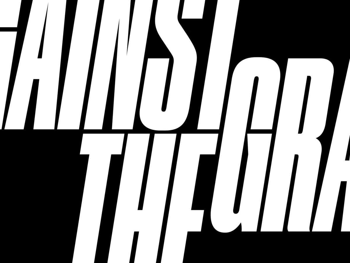
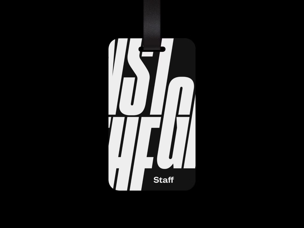
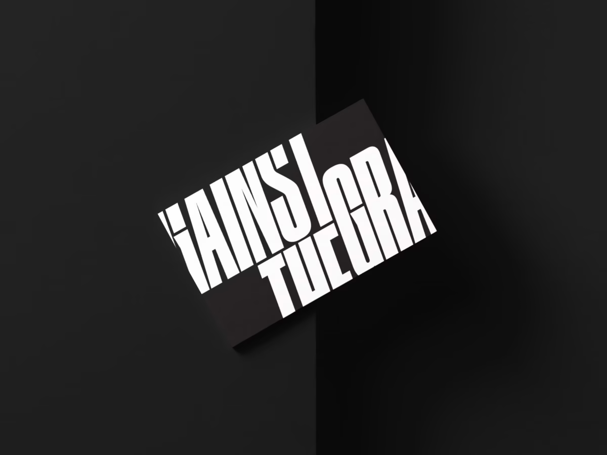
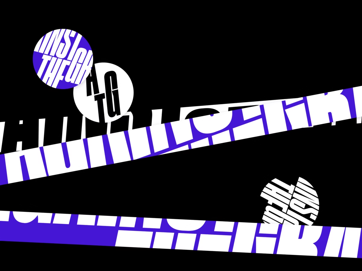
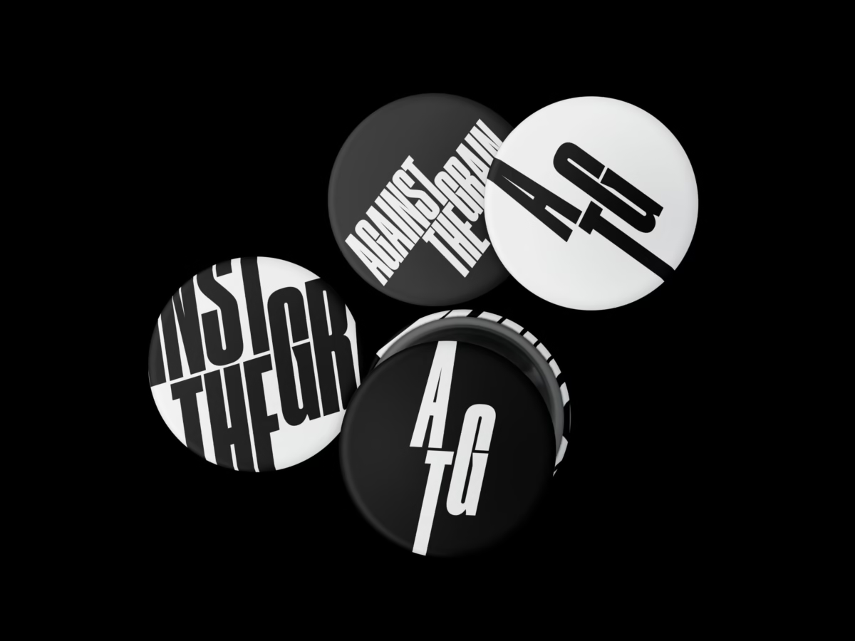
We designed a dramatic typographic mark that visually conveyed the meaning of the phrase and used this as a graphic marker to use prominently on his website and other marketing material. Large-scale and over-cropped sections of the logotype created a strong graphic language to use in conjunction with the vast array of event imagery in his case studies. Without being overly corporate in style, the new identity highlights a strong confidence in his craft to expand beyond the arts sector.
